Posts

Living Landscape

Image
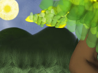
For this we had to make a landscape however we wanted, using body parts. I used skin for the sky, and changed the color to blue. For the grass I used split ends on hair, and made them green. In the background I wanted to put hills, so I used the heal of a foot. The tree is a women arm, and the leaves on it are finger nails. The sun is an eye ball. I think this looks like something I would draw in real life.

Colorization

Image
For this assignment, we had to make a black and white picture in color. I think I did a really good job with the floor the women, with the orange jacket is standing. I wanted this to look realistic. I used colors I think would be where I put them. I made the guys jacket tan because I didn't want it to be black. When I saw the middle girl was in Miami, I decided to use the University of Miami's color. I Like how I made the girl in the back match her shoes to her jacket.

Cut and paste

Image
I loved this assignment. We were told to cut out images of real things, and to put them on a canvas. Nothing that wasn't alive was to be shown. First I picked the old man meme, because it is one of my favorite memes. I put him in the background to be sure that there was no blank space. The I put other viral pictures like Rebeca Black, Kim Kardashian crying, and Justin Bieber's mug shot. Then I put pictures of my favorite celebrities, excluding Trump. I only put trump because I couldn't think of anyone else.

Self Portrait

Image
We recreated a picture of ourselves for this assignment. I wanted this to look like a painting. I used the brush tool a lot, and played around with the different brush strokes. I also adjusted the opacity of the paint brush. Additionally, I wanted to use realistic colors while recreating myself. I wanted the background to stand out from my being. I really like the blue colors I used. I think the funky background gives it a fun twist.

Calligram

Image
The Calligram assignment was very cool. We had to recreate an image of ourselves, using words from a letter our future selves wrote to our current selves. The entire idea is super fun. Anyways, this was the first assignment we really got to be creative with. I wanted mine to look very realistic. Initially, I had many places where I was going to put the letters, however the process is very time consuming. I decided to put the letters in a larger space. I completely dis formed the letters, so that they were unrecognizable. The idea of distortion worked in my favor, I think it looks relatively real (especially my eyes). I chose a blue background because it is my favorite color. The reason I made my hair readable is because I wanted to show that the colors used were still words, even though they don't look like it.

Logo

Image
For the third assignment we used to a different program called Illustrator. We had to recreate an image using the pixels previously given to us. Out of all the logos and characters we were able to choose from, I decided to pick Yoshi. I picked Yoshi because I liked his coloring, and he's adorable. Very little creative decision were made while making Yoshi. I had to copy all of the lines and colors the best I could. Though, I think it turned out very well.

Canvas Landscape

Image
The second assignment we had to turn in was the "Canvas Landscape". The second assignment was also using Dreamweaver. In order to successfully complete the landscape, I had to use skills I had previously learned from the first canvas exercise. Basically, we were told to create a landscape of a house, a flower, a living creature a cloud, and a sun. Additionally, we were required to use specific curves and shapes. While creating this landscape, I knew I wanted the grass to be green, the sun to be yellow, the sky to be blue, and the cloud to be white. I think the red and the orange of the house complemented each other well. I wish I had located the light, coming from the top left corner, by the sun. My favorite part is the flower, because I think the color pink I used is very pretty.